dm distribution centre, Waghäusel, Germany
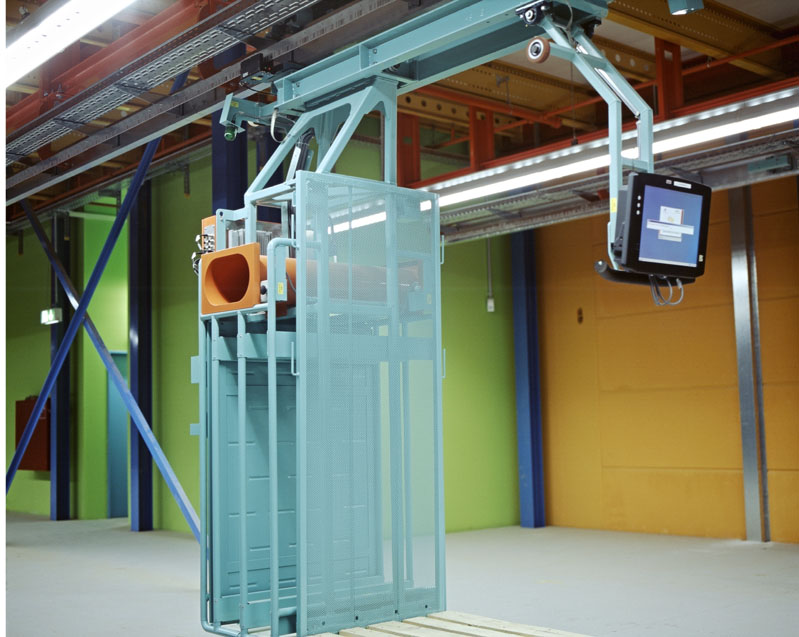
“Color Spaces for People” – The title of my color concept for the dm distribution center Waghäusel contains a double plural that captures the bottom line of my artistic mind. When I designed this warehouse, touching all elements besides the floor and the ceiling panels, I focused on diversity instead of monotony, continual arousal of attention in the routine, the highest possible quality of life for approximately 300 staff members in such a highly automated work process. Giving consideration to the people working in this space, its dimensions as well as the complexity of the logistic processes required a self-conscious, expressive approach. My artistic intervention should not disappear in the functionally defined structure of the space but should, in harmony with this structure, live and breathe as an independent organism.
An important factor of the concept’s success was the fact that technical and artistic planning were closely merged. The varnishing of the constructional elements was already accomplished during pre-fabrication, making the assembly easier as well as avoiding additional expenses for the color design.
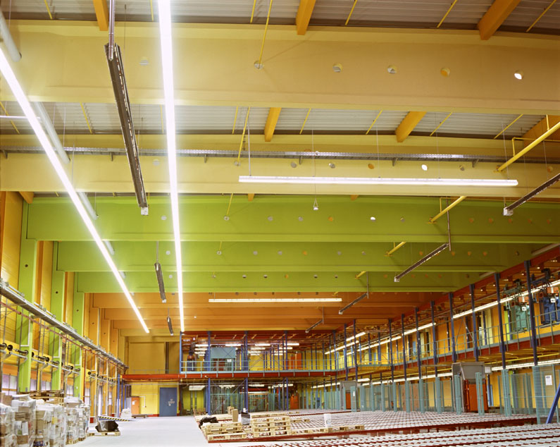
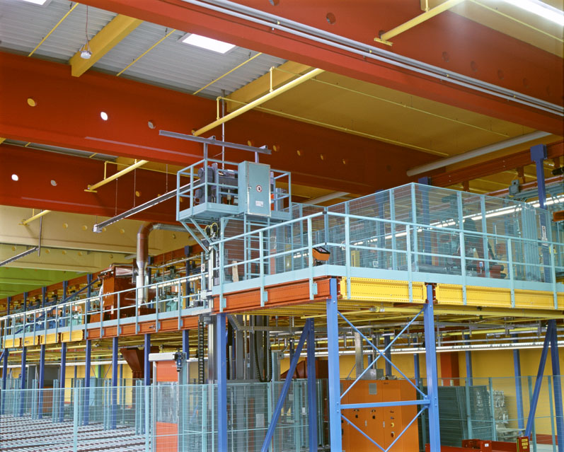
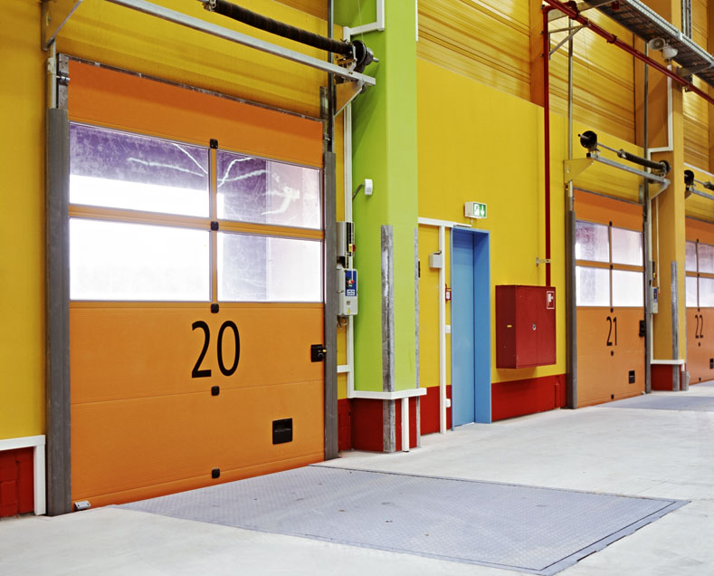
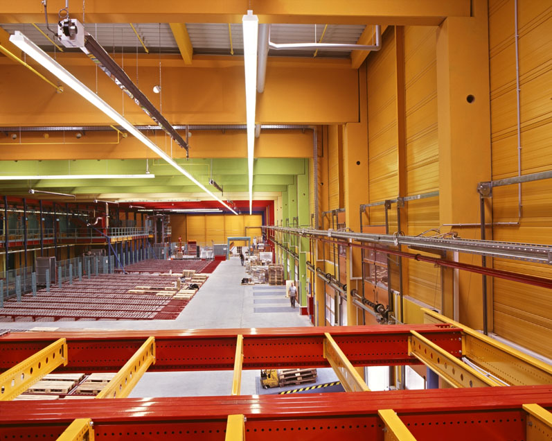
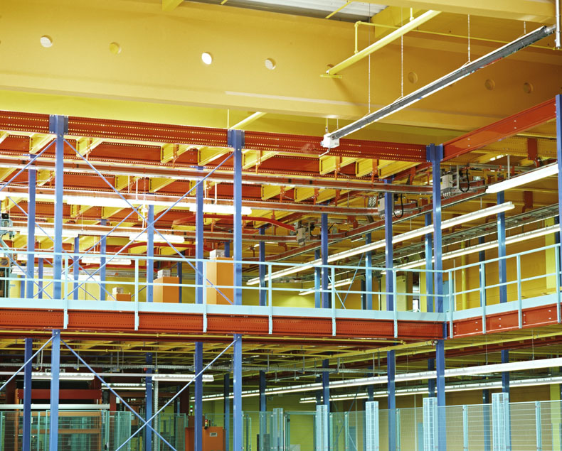
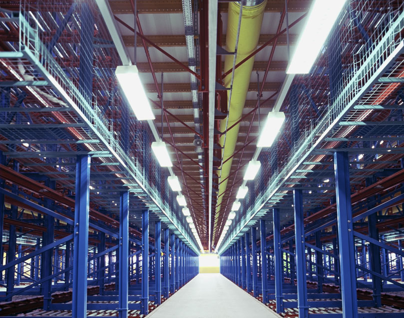
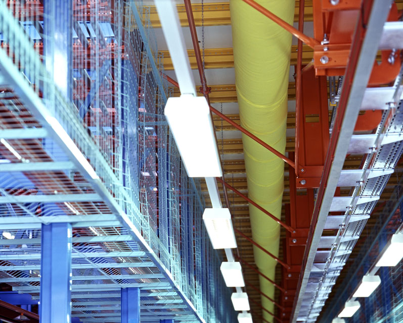
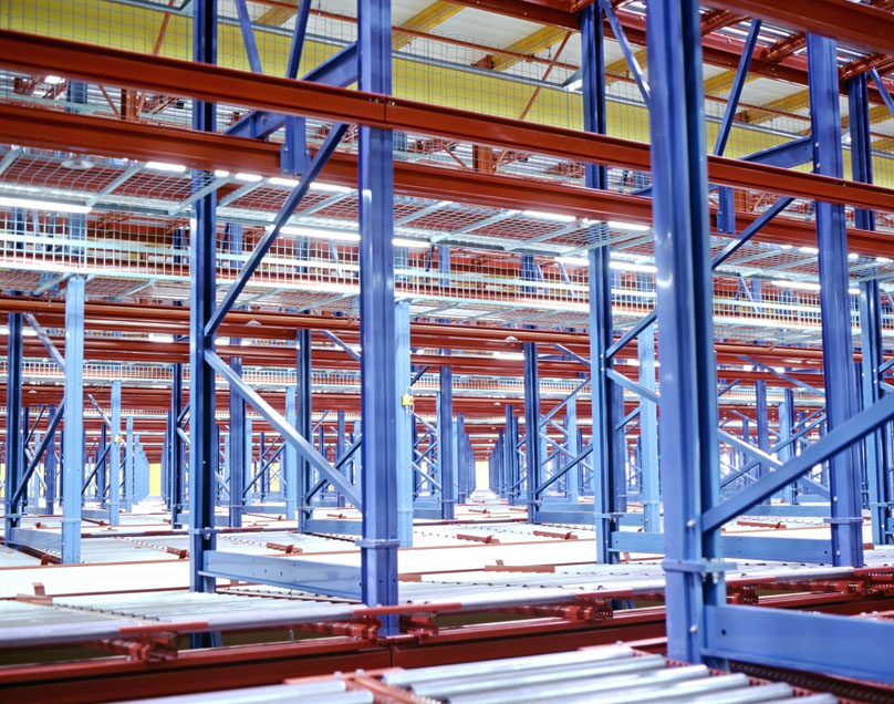
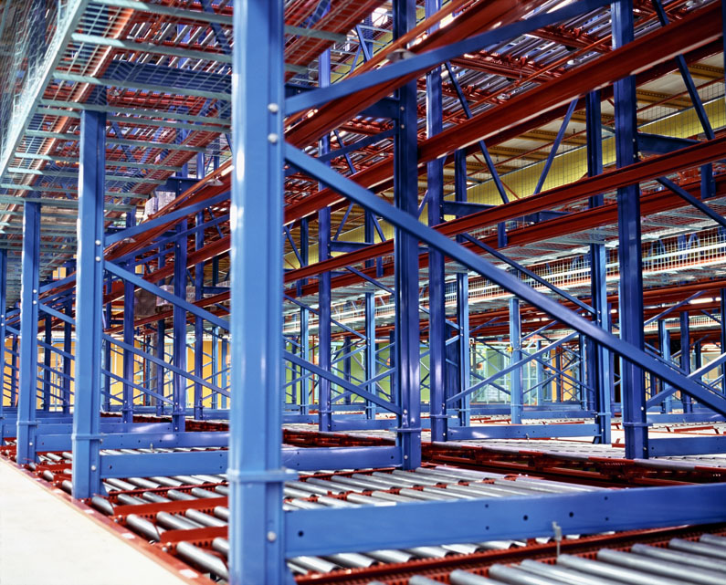
Color is a primary stimulus; color triggers impulses, color assists with orientation. In the Waghäusel project it was important to create a color organism that would unfold its energy in a clear order. The colors of the warehouse and the technical facilities serve the flow of goods as a riverbed and accompany people in their workflow. The overall framework is the evolvement of all used colors from dark to light and low to high. This creates a feeling of ascent inside the distribution center and embodies the metaphor of evolving from earth to light.
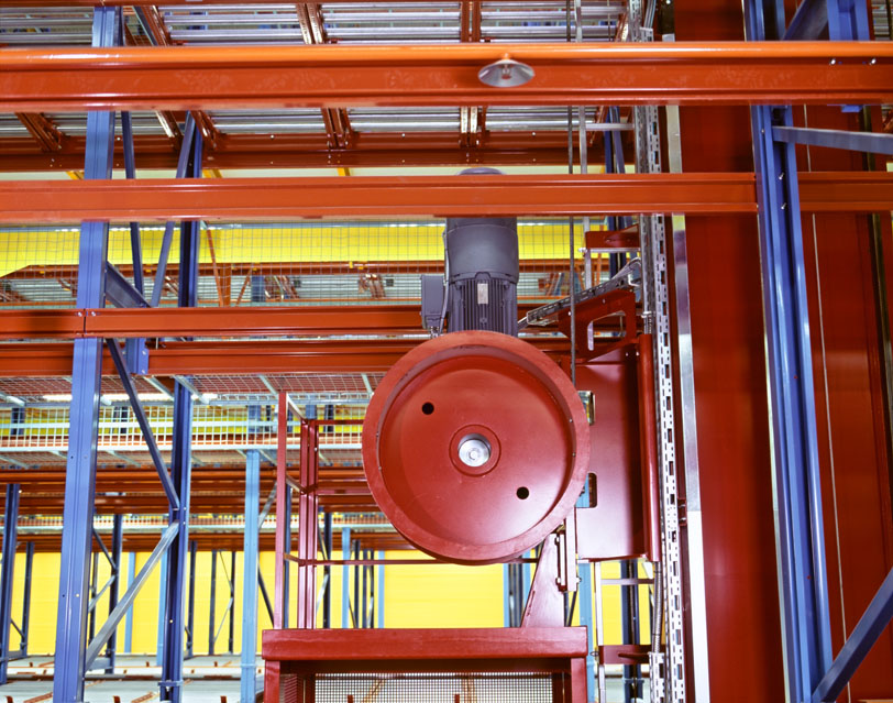
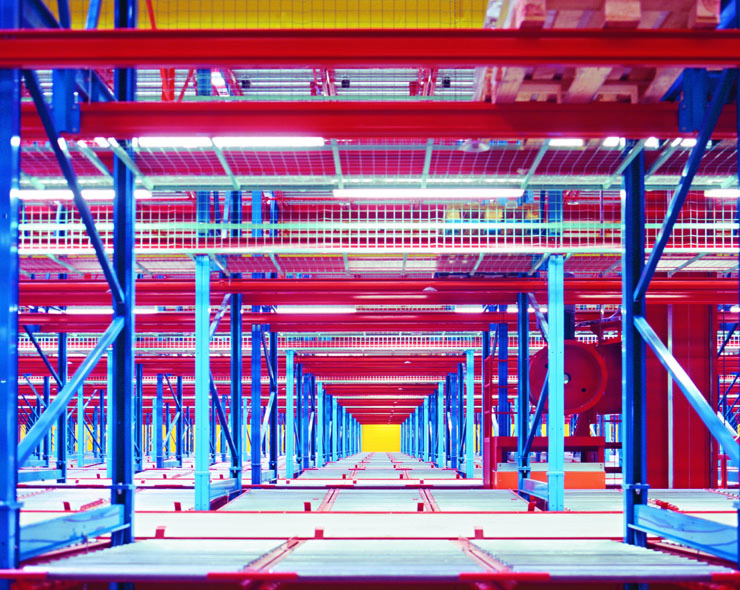
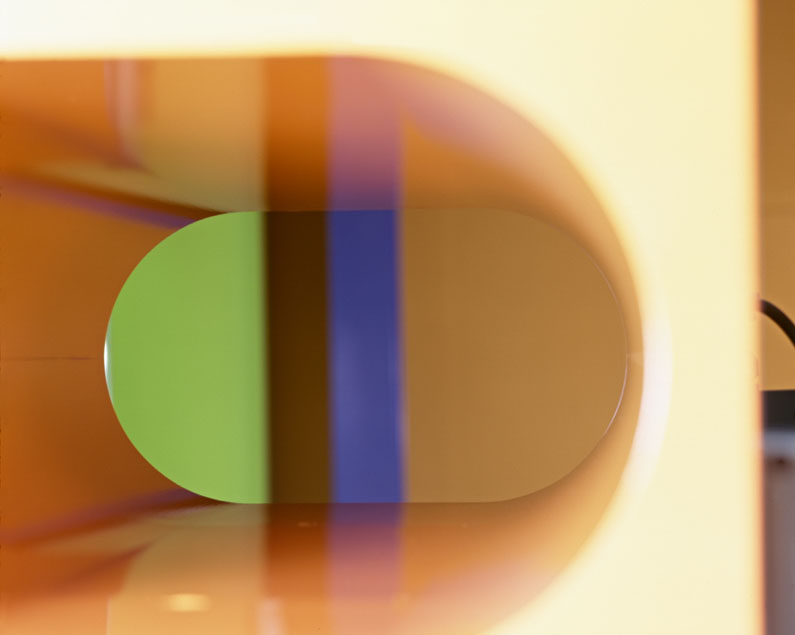
Red, orange, dark yellow, light yellow, green, blue, and violet are seven RAL scale shades that comply with industrial standards. At the same time they serve as diverse symbols, including the identification of the planets. All seven colors are clear – no discreet pastel shades that would blur with the gray and brown of the product boxes, resulting in an indefinable fog of drabness. Instead, the colors are expressive, each of them calling out: “Here I am!” Every day they invite to new conscious perceptions. They live with the people in the warehouse and make their workflow and the flow of the goods sensually perceivable.
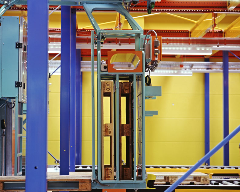
Logistics means explicit action within complex and multi-layered processes. According to Heraclitus, “logos”, literally translated as ³speech², is the legality that interweaves the world. The interface to functional aesthetics of the color concept can be found here. Thus, the colors also function as a guiding system, e.g. the vertical sides of the shelves are blue, the pass-through areas are green, the drive sections of the transporters are dark red, and the control components are orange. Furthermore, the color design is artistically applied; it organizes and articulates the enormous dimensions of the space. The colors in the warehouse exist in the same way as parts of a concentrated workflow and, moreover, as independent individuals as the people who work here.